Magnificent 7 valuation dashboard Excel - if you are trying to answer how expensive NVDA, MSFT, AAPL, GOOGL, AMZN, META, and TSLA are versus their own earnings, versus the rest of the S&P 500, and versus where they traded twelve months ago, a properly designed Excel dashboard is the cleanest place to do it. The seven stocks now account for roughly one-third of the S&P 500 by market cap, so understanding their multiples is no longer optional for anyone who tracks index exposure. This guide walks through how to build a professional-grade valuation dashboard for the Magnificent 7 in Excel, what to watch each week, and what is actually inside the free template we built using live MarketXLS formulas.
Magnificent 7 valuation dashboard Excel template preview
Magnificent 7 Valuation Snapshot (May 2026)
The table below is the kind of cross-section the dashboard renders on the Dashboard sheet. It is a representative snapshot for educational purposes; the live template recalculates every cell on file open.
| Ticker | Price | Mkt Cap ($B) | Trailing PE | Fwd PE | PEG | EV/EBITDA | Rev Growth (YoY) | EPS Growth (YoY) |
|---|---|---|---|---|---|---|---|---|
| NVDA | $132 | 3,310 | 58.5 | 36.0 | 1.05 | 52.0 | 78% | 125% |
| MSFT | $438 | 3,260 | 36.5 | 31.5 | 2.45 | 25.0 | 16% | 19% |
| AAPL | $212 | 3,220 | 33.5 | 29.5 | 3.10 | 23.5 | 5% | 9% |
| GOOGL | $178 | 2,180 | 26.5 | 21.5 | 1.45 | 17.8 | 15% | 29% |
| AMZN | $193 | 2,010 | 48.5 | 36.5 | 1.85 | 18.5 | 13% | 42% |
| META | $512 | 1,300 | 28.5 | 24.5 | 1.35 | 18.0 | 22% | 59% |
| TSLA | $185 | 590 | 68.5 | 58.0 | 4.85 | 44.0 | 3% | -22% |
For reference, the broader S&P 500 trades around a 22.5 trailing PE and a 20.0 forward PE, with combined Mag 7 weight of roughly 33 percent of the index. Six of the seven names trade richer than the index on a trailing basis. Only NVDA looks reasonable on a PEG basis because triple-digit earnings growth is doing the heavy lifting.
Why a Magnificent 7 Dashboard Matters Right Now
The Magnificent 7 are not just seven stocks. They are the single largest exposure inside almost every S&P 500 index fund and ETF in circulation. When the basket compounds, index funds compound. When the basket compresses, the same is true.
Three reasons a dedicated dashboard pays for itself:
- Concentration risk in passive vehicles. A market-cap-weighted S&P 500 index fund effectively allocates a third of its capital to seven names. Investors who think they own diversified equity exposure often hold the same names in concentrated form.
- Earnings yield versus 10-year Treasuries. The Mag 7 median earnings yield is roughly 2.85 percent against a 10-year Treasury yield near 4.35 percent. That spread has been negative for over a year and is one of the most-watched valuation signals on the desk of every long-short manager.
- Multiple dispersion within the basket. NVDA at 36 forward PE with 125 percent earnings growth and TSLA at 58 forward PE with negative earnings growth are not the same trade. A single PE number for "the Mag 7" hides the dispersion that actually matters.
A purpose-built Excel dashboard solves this. It gives you single-name detail, basket-level aggregates, scenario stress tests, and a concentration view all in one place.
What's Inside the Template
The Magnificent 7 Valuation Dashboard ships as a 10-sheet workbook designed to look and feel like a $29-$49 product on Gumroad or Etsy. Every sheet is purpose-built; nothing is filler.
- Cover. A branded cover page with a clear title, edition tag, version line, "Data as of" date, MarketXLS branding, and a table of contents. Hide-gridlines design so the first impression is dashboard-grade, not spreadsheet-default.
- How To Use. A 5-minute walkthrough from open to insight. Numbered steps explain how the workbook flows from Inputs to Dashboard to Scenario Analysis to Concentration Risk.
- Dashboard. The headline sheet. A KPI tile row at the top shows median PE, median forward PE, median PEG, the count of names trading richer than the S&P 500 PE, combined market cap in trillions, and the Mag 7 share of the index. Two embedded charts compare trailing PE and PEG across the seven names. A 17-column screener at the bottom is heavily conditionally formatted: green is reasonable valuation with healthy growth, red is stretched.
- Inputs. Yellow input cells with gold borders for portfolio size, target Mag 7 allocation, multiple expansion assumption, and earnings growth assumption. Data validation dropdowns for valuation tier (Bull, Base, Bear), allocation recipe (Cap Weighted, Equal Weighted, PEG Weighted, Quality Weighted), and risk profile. Every downstream sheet picks up these cell references.
- Scenario Analysis. Bear, base, and bull cases for each of the seven names. Bear case applies a 30 percent forward PE compression. Base case holds forward PE flat. Bull case applies a 15 percent multiple expansion. All three use the same consensus next-year EPS, so you can stress-test the multiple independently from earnings.
- Concentration Risk. Combined Mag 7 market cap, Mag 7 share of the S&P 500, earnings yield versus 10-year Treasury yield, and a single-name contribution table showing each name's share of the basket and of the index. A pie chart visualizes the cap-weighted distribution.
- Allocation Sizer. Three position-sizing recipes - cap weighted, equal weighted, and PEG weighted - applied to your target Mag 7 allocation. The cap-weighted view mirrors what an S&P 500 index fund delivers. The equal-weighted view neutralizes the cap-weight tilt. The PEG-weighted view tilts toward the names with the lowest growth-adjusted multiples.
- Correlation Matrix. A 7x7 grid of one-year daily return correlations. Conditionally formatted as a red-to-green heatmap so the cluster patterns jump off the page. A reading guide explains how to interpret the numbers.
- Methodology. A one-page explainer covering watchlist definition, valuation metrics used, growth and quality metrics, scenario assumptions, data sources, and explicit limitations. This is what lifts a free spreadsheet into a professional-grade reference.
- Glossary & Disclaimer. Term definitions for PE, forward PE, PEG, EV/EBITDA, price/sales, price/book, ROE, operating margin, beta, concentration risk, equal-weighted, cap-weighted, earnings yield, multiple expansion, multiple compression. Plus the educational-only disclosure.
Both files are formatted with frozen panes, tab colors on every sheet, hidden gridlines on the Cover and Dashboard, and a printable landscape layout on the Dashboard sheet.
The Approach: How to Think About Mag 7 Valuation
There is no single "correct" multiple for the Magnificent 7. The right valuation lens depends on what question you are asking. The dashboard exposes four lenses simultaneously.
Lens 1: Trailing PE Versus the Index
Trailing PE anchors how the market is paying for actual delivered earnings. The S&P 500 trailing PE has hovered around 22 to 25 for most of 2025 and 2026. Inside the Mag 7, six names trade above that anchor and one trades close to it. That is a useful first read but a weak full answer because trailing earnings ignore the growth profile that justifies the multiple.
Lens 2: Forward PE With Consensus EPS
Forward PE divides today's price by next year's consensus EPS estimate. It is forward-looking and accounts for the upcoming earnings power that analysts are modeling. For high-growth names, forward PE compresses materially relative to trailing PE. NVDA's trailing PE of 58 collapses to a forward PE near 36 once next year's EPS is incorporated. The dashboard surfaces both numbers side by side so you see which names are growing into their multiples.
Lens 3: PEG Ratio
PEG divides PE by expected earnings growth. A PEG of 1 suggests the multiple is in line with growth; below 1 looks cheap; above 2 looks rich. The PEG view reorders the Mag 7 dramatically. NVDA, which looks expensive on PE, looks reasonable on PEG because 125 percent earnings growth more than justifies the multiple. AAPL, which looks moderate on PE, looks stretched on PEG because single-digit earnings growth cannot support a 30-multiple. The dashboard renders both views in adjacent columns so the dispersion is impossible to miss.
Lens 4: EV/EBITDA and EV/Revenue
PE has a structural weakness: it ignores capital structure. EV/EBITDA captures debt and cash, so it works better for cross-sector comparison. EV/Revenue is the right metric when earnings are negative or extremely noisy. The dashboard exposes both so you can sanity-check the PE-based view against the capital-structure-neutral version.
The educational hypothesis encoded in the heatmap: a name is attractive when forward PE is moderate, PEG is below 2, EV/EBITDA is below the basket median, revenue and earnings growth are positive double-digits, and ROE plus operating margin clear quality thresholds. A name flashes red when forward PE clears 40, PEG clears 3, and growth is decelerating. The dashboard does not buy or sell on your behalf - it gives you the visual that supports your own judgment.
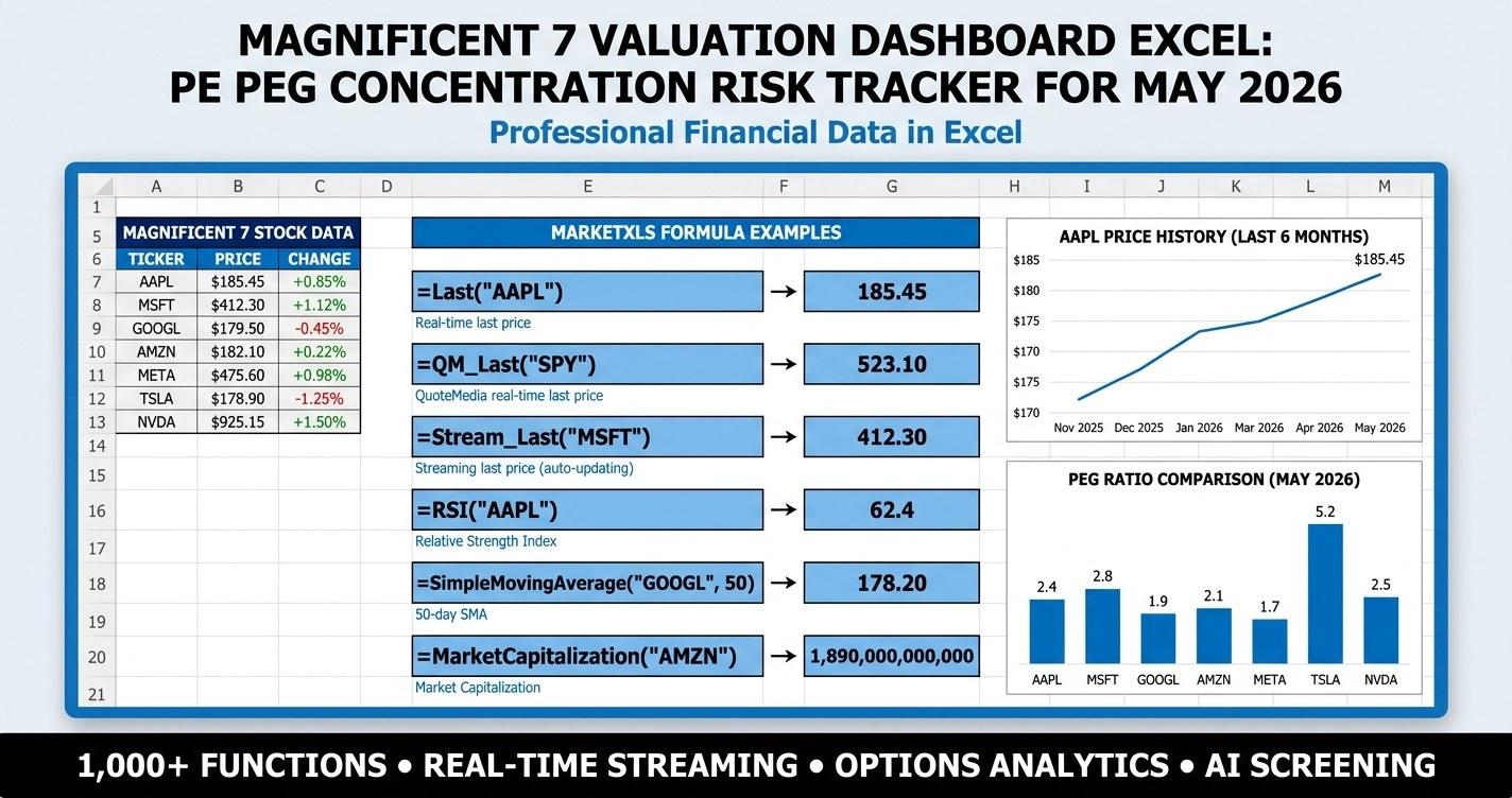
MarketXLS Implementation
Every metric in the dashboard is driven by MarketXLS Excel functions. Here are the formulas used on the Dashboard sheet, each verified via the MarketXLS Function Docs database.
Price and Market Cap
=QM_Last("NVDA")                       ' Live share price
=MarketCapitalization("NVDA")          ' Market cap in dollars
=Name("NVDA")                          ' Full company name
=Sector("NVDA")                        ' GICS sector
=Industry("NVDA")                      ' Industry classification
Valuation Multiples
=PERatio("NVDA")                       ' Trailing twelve-month PE
=ForwardPE("NVDA")                     ' Consensus forward PE
=PEGRatio("NVDA")                      ' PE divided by expected growth
=PriceToSales("NVDA")                  ' Price-to-sales ratio
=PriceToBook("NVDA")                   ' Price-to-book ratio
=EnterpriseValueToEbitda("NVDA")       ' EV / EBITDA
=EnterpriseValueToRevenue("NVDA")      ' EV / Revenue
Growth Metrics
=QuarterlyEarningsGrowthYoy("NVDA")    ' YoY quarterly EPS growth
=QuarterlyRevenueGrowthYoy("NVDA")     ' YoY quarterly revenue growth
=EpsEstimateAvgNextYear("NVDA")        ' Consensus next-year EPS estimate
=RevenueEstimateAvgNextYear("NVDA")    ' Consensus next-year revenue estimate
Quality and Risk
=ReturnOnEquity("NVDA")                ' TTM return on equity
=ReturnOnInvestedCapitalOneYear("NVDA") ' Return on invested capital
=OperatingMargin("NVDA")               ' TTM operating margin
=GrossMargin("NVDA")                   ' TTM gross margin
=Beta("NVDA")                          ' Beta versus market
Technical Reference Levels
=FiftyTwoWeekHigh("NVDA")              ' 52-week high
=FiftyTwoWeekLow("NVDA")               ' 52-week low
=PercentBelowFiftyTwoWeekHigh("NVDA")  ' Drawdown from 52-week high
=StockReturnOneYear("NVDA")            ' Trailing one-year return
=SimpleMovingAverage("NVDA",200)       ' 200-day moving average
Correlation
=Correl(QM_GetHistory("NVDA","1Y","Close"), QM_GetHistory("MSFT","1Y","Close"))
Every one of those formulas refreshes on file open or on a manual refresh. The static sample workbook is pre-filled with illustrative values and includes a comment on each data cell showing the formula that would produce it.
Reading the Dashboard
The Dashboard sheet packs a lot into one screen. Here is how to read it from the top down.
KPI Tile Row
Six tiles span the top of the sheet:
- Median PE. The middle PE across the seven names. Compare to the S&P 500 PE printed in the tile subtitle.
- Median Forward PE. Looks one year forward. Compare to the index forward PE for the cleanest like-for-like read.
- Median PEG. A single read on whether growth justifies the multiples. PEG below 2 is healthy; above 2 starts to look stretched.
- Rich vs SPX. Count of Mag 7 names trading above the S&P 500 PE. Six of seven is the current reading.
- Combined Mkt Cap. Total market cap in trillions. This is the headline number behind the concentration narrative.
- Share of S&P 500. What percent of the index the Mag 7 represent. North of 30 percent indicates historically extreme concentration.
Screener Heatmap
Below the KPI row, a 17-column screener lists every name with price, market cap, all four valuation multiples, growth metrics, quality metrics, and recent performance.
Color rules:
- PE columns shade green at 15, yellow at 30, red at 70.
- PEG column shades green at 0.8, yellow at 2.0, red at 5.0.
- Revenue growth shades red at 0, yellow at 10 percent, green at 50 percent.
- Earnings growth shows 3-arrow icons keyed to negative, modest, and strong growth.
- Market cap displays data bars - the visual length is proportional to the size of the company.
- 1Y Return shows 3-arrow icons keyed to negative, flat, and strong performance.
Charts
Two embedded charts sit below the screener. The first compares trailing PE across the seven names. The second compares PEG. Read them together - a tall PE bar with a short PEG bar is a name where growth is doing the work; a short PE bar with a tall PEG bar is a name where the multiple is rich relative to growth.
Concentration Risk: The Quiet Story Behind the Mag 7
The Concentration Risk sheet exists because the Magnificent 7 are not just seven stocks - they are roughly a third of every market-cap-weighted S&P 500 index fund in existence. This is the largest concentration the S&P 500 has seen since the late-1990s tech era.
The sheet displays:
- Combined Mag 7 market cap (north of $14 trillion as of mid-May 2026).
- Median Mag 7 PE versus S&P 500 PE.
- Earnings yield for the Mag 7 (median ~2.85 percent) versus the S&P 500 (~4.45 percent) versus the 10-year Treasury (~4.35 percent).
- Mag 7 share of the S&P 500 index (~33 percent).
- Single-name contribution table showing each ticker's share of the Mag 7 basket, share of the S&P 500, equal-weighted allocation, and cap-weighted allocation.
The earnings yield spread is the educational anchor. When the Mag 7 earnings yield is materially below the 10-year Treasury yield, equity investors are accepting a lower cash-on-cash return than they could get from a risk-free instrument, on the bet that earnings growth will close the gap. That can persist for long periods. It can also unwind quickly. The dashboard does not predict which way; it gives you the number so you can decide whether you are comfortable with the spread.
A pie chart on the same sheet visualizes the cap-weighted contribution. The visual hierarchy is striking - the three largest names (NVDA, MSFT, AAPL) take up roughly two-thirds of the basket weight, and the smallest two (META, TSLA) carry less than 15 percent combined.
Scenario Analysis: Stress-Testing the Multiple
The Scenario Analysis sheet runs a simple but useful stress test. For each Mag 7 name, it projects a bear, base, and bull price target by applying a fixed multiple-expansion or compression factor to next-year consensus EPS.
- Bear case applies a 30 percent forward PE compression. This captures what happens if sentiment resets, rates spike, or a single large name disappoints. NVDA's bear target falls from ~$132 to ~$92. MSFT's bear target falls from ~$438 to ~$306.
- Base case holds forward PE flat at consensus. Earnings do the work, and the price advances at the rate next-year EPS grows.
- Bull case applies a 15 percent forward PE expansion. This captures continued AI capex tailwinds, a soft-landing macro environment, or a multi-quarter earnings surprise cycle.
The output is a per-name target across all three cases. The conditional formatting flags which names have the widest bear-to-bull dispersion and which have tighter ranges. It is a stress test, not a forecast.
Allocation Sizer: Three Recipes
The Allocation Sizer takes your portfolio size and target Mag 7 allocation from the Inputs sheet and distributes capital three different ways.
- Cap-weighted. Mirrors what an S&P 500 index fund delivers. NVDA, MSFT, and AAPL dominate. TSLA receives the smallest slice.
- Equal-weighted. Each name gets one-seventh of the basket. Neutralizes the cap-weight tilt. Useful for investors who want exposure to the Mag 7 theme without the implicit bet on the three largest names continuing to lead.
- PEG-weighted. Tilts toward names with the lowest PEG ratios. The recipe favors NVDA and META, both of which have PEG below 1.5. Underweights TSLA and AAPL, both of which have PEG above 3.
The sheet also calculates the share count implied by the cap-weighted dollar allocation so you can convert directly into a brokerage order list. It is a starter framework, not a recommendation - swap the weights for your own factor recipe if you have a different conviction.
Correlation Matrix: Diversification Theater?
The Correlation Matrix sheet renders one-year daily return correlations across all 21 pairs of the seven names. The output is a red-to-green heatmap centered on 0.4.
The reading: most pairwise correlations sit between 0.4 and 0.7. TSLA is the lowest-correlation name, sometimes dipping to 0.35 against the rest. MSFT and GOOGL are the highest, often above 0.7. The cluster generally trades as a group during risk-on or risk-off regimes.
Implication: holding all seven names does not deliver as much diversification as it might appear on a name-count basis. From a factor lens, the basket is one bet on US large-cap technology, AI infrastructure, and digital advertising. From a name-count lens, it looks like seven bets. Both readings are partially correct - the dashboard surfaces the correlation evidence so you can decide which framing matters for your portfolio.
FAQ
What are the Magnificent 7 stocks?
The Magnificent 7 refers to NVIDIA (NVDA), Microsoft (MSFT), Apple (AAPL), Alphabet (GOOGL), Amazon (AMZN), Meta Platforms (META), and Tesla (TSLA). The term gained traction in late 2023 as these seven mega-cap technology and consumer names drove the majority of the S&P 500 return for the year and continued to dominate index performance into 2024, 2025, and 2026.
How much of the S&P 500 do the Magnificent 7 represent?
As of mid-May 2026, the Magnificent 7 combined account for roughly 33 percent of the S&P 500 by index weight. NVDA, MSFT, and AAPL alone account for about 20 percent. This is one of the highest concentrations the index has seen since the late-1990s technology era, and it has implications for how diversified a market-cap-weighted index fund actually is.
What is the average PE ratio of the Magnificent 7?
The median trailing PE across the seven names sits around 36 with the basket pricing closer to 40 on a cap-weighted basis as of mid-May 2026. The S&P 500 trailing PE is approximately 22.5, so the Mag 7 trade at a meaningful premium to the broader index. Forward PE is lower because consensus EPS estimates for next year incorporate continued earnings growth, particularly for NVDA, META, and GOOGL.
Which Magnificent 7 stock is cheapest on PEG?
PEG ratios vary widely across the basket. NVDA looks most reasonable on PEG (~1.05) because triple-digit earnings growth supports the multiple. META and GOOGL follow at PEG around 1.35 to 1.45. TSLA looks most expensive on PEG (~4.85) because earnings growth has turned negative while the multiple has not fully compressed. PEG is a useful but imperfect lens - it depends entirely on whether analyst growth estimates prove accurate.
How do I track Magnificent 7 valuation in Excel?
The cleanest approach is a dashboard-style template that pulls live valuation multiples, growth metrics, and concentration data into a single Excel sheet using MarketXLS functions. The free template linked at the end of this post does exactly that: live PE, forward PE, PEG, EV/EBITDA, revenue growth, earnings growth, ROE, operating margin, beta, and one-year return for all seven names, refreshing on file open.
Is Magnificent 7 concentration a risk?
It depends on the lens. From a diversification perspective, yes - if a third of your equity exposure sits in seven highly correlated names, you have less diversification than a name-count view suggests. From a quality perspective, the seven names include some of the most profitable and dominant businesses in modern market history. The dashboard does not answer the question for you. It surfaces the data - share of index, earnings yield versus Treasury yield, single-name contribution, correlation cluster - so you can frame the risk on your own terms.
Download the Templates
Both files are free. Built with MarketXLS Excel functions, designed to look and feel professional-grade.
Download the templates:
- - Pre-filled snapshot for review
- - Live-updating dashboard
Each is a 10-sheet workbook with a branded cover page, a How To Use tutorial, a KPI dashboard with conditional formatting and embedded charts, an Inputs sheet with dropdown controls, scenario analysis, concentration risk, allocation sizer, correlation matrix, methodology, and glossary.
The Bottom Line
The Magnificent 7 are simultaneously the seven most-discussed stocks in US markets and the single largest exposure inside most index funds. Tracking their valuation, growth, and concentration is no longer optional for anyone who manages a market-cap-weighted equity allocation.
A purpose-built Excel dashboard answers the four key questions in one screen: how expensive are these names on PE, forward PE, PEG, and EV multiples? How does the basket compare to the broader index on earnings yield versus the 10-year Treasury? How concentrated is your effective exposure if you hold an S&P 500 index fund? And how correlated are the seven names with each other on a daily-return basis?
The template above ships with all of that, plus a scenario analysis sheet that stress-tests what a 15 percent multiple expansion or a 30 percent compression does to each name, and an allocation sizer that distributes capital three different ways. None of it is investment advice; all of it is the visual you need to support your own judgment.
If you want to build it yourself in Excel from scratch, the MarketXLS function library and the feature catalog document every formula used in the template. If you would rather see how the live dashboard refreshes against the Mag 7 in real time, book a demo with MarketXLS and we will walk through the template with your watchlist.
